A Kettle of Hawks

I love this two-colour scraperboard-illustrated little book.

From 8-8-80, it belonged to the collection of the National Library of New Zealand, and bears all the original inscriptions and stamps (including catalogue card in the back pocket and date due slip. The last time it was due back to the library was on 5 DEC 1991. But despite that 11 year pedigree, it was only issued seven times, which may account for the fantastic condition of the ivory pages…

Arnosky is a prolific and self-taught illustrator, author and naturalist. This book was published when he was 33, in 1979. Delving into his back catalogue is an interesting journey for many reasons, including his huge range of styles and media. But there’s something perfectly simple about ‘A Kettle of Hawks’ that resonates with me more than any of those full-colour cornucopia of wildlife.

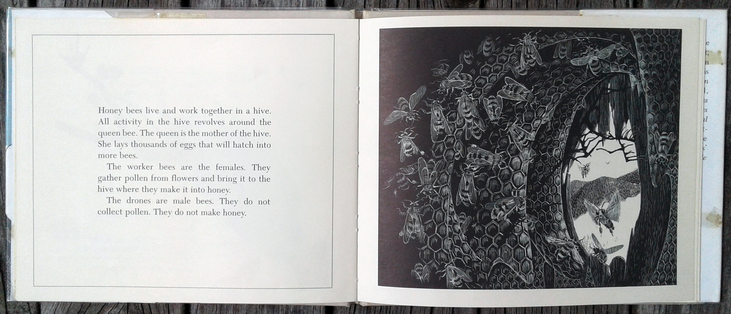
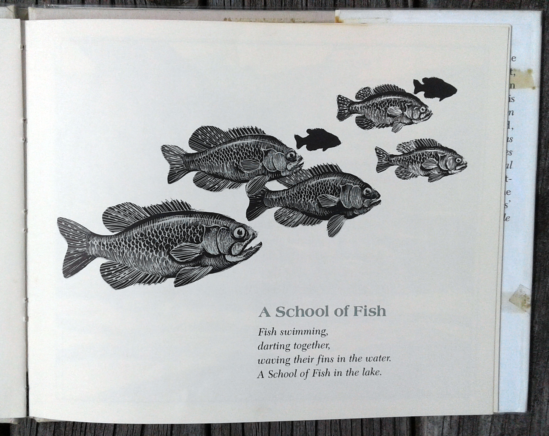
The mark-making is varied and descriptive – the hatching describes a hawk’s breast swelling on an intake of breath, the filaments of feather, the hills and the sea in one image alone. There’s a beautiful variety in scene and viewpoint, from arresting front-on shots of birds swooping towards the viewer, to cosy moments inside a honey bee hive. Isolated fish still live in a three dimensional world through the use of tone and hue, with the closest fish described in a duck-egg blue through to black, the middle-distance fish in black and white only, sitting closer to the page, and finally a pair in black only- a silhouette. The full-page illustrations use that blue to good effect too – creating depth in the scene that balances the messy scraperboard.

Most pages are framed with a thin blue line, but some are not, and the ants dance freely out of bounds, anchored only by a pavement crack and a poem. Another lovely moment of balance against the larger illustrations and blocks of text.

I love, also, the conversational tone of the writing, and there is a strong sense of the author playing with these phrases as he treks through the Vermont hills. The information is clear and concise without being heavy, and just enough to pique the interest of the young reader to continue their adventure in the natural world…

‘They may never be too tired to honk up a good goose conversation with their fellow travelers.’

Sources:

http://www.jimarnosky.com/

https://www.thechildrensbookreview.com/weblog/2015/09/illustration-inspiration-jim-arnosky-creator-of-frozen-wild.html

https://bookpage.com/interviews/7967-jim-arnosky#.WImYs5LGY0o


The Boy and the Taniwha

The Boy and the Taniwha by R. L. Bacon and Para Matchitt
First published by Collins, 1966.

This is the second edition, and has obviously lived quite a life, containing stamps for the ‘New Zealand Consulate General, New York’ and the ‘Embassy of New Zealand, 37 Conservatory Circle, N.W., Washington D.C., 2008’ on the dust jacket and front endpaper. I wonder where else it journeyed to find its way to me, in a local op shop, for a mere single dollar…

I was first attracted to the interesting tertiary colour palette, but a couple of other things have grabbed my attention about this book. The first is the teaching elements, including the captioned drawings on the end papers, and the introductory (and fairly incorrect) Māori pronunciation guide. I love that this moves the book from being a simple story book, into a teaching resource, and I guess that’s why it found its way to America all those years ago.

The second is the illustrator’s use of Māori patterns (or lack thereof). This confuses me a little as the elements mentioned above, and the story itself seem to go to great lengths to provide accurate explanations of elements of Māori culture, where the illustrations seem to delve into flights of fancy at several points. The artist seems to have been mainly a carver, which I thought would have signalled a keen interest in accurate representations of pattern, but perhaps not…

Matchitt employs swirls (or koru), a well-known Māori symbol, as well as the chevron/zigzag pattern (which can have many different meanings depending on context), but beyond this, seems to be working mainly in the decorative style of the 1960s rather than using further traditional Māori patterns. This may have been a deliberate design decision, but I think that it is detrimental to the story as a whole because the images are not really illustrations, more adornments, and they would have fitted better had they been more traditional, following the tone of the story.

I love the decision to have a ‘storyteller’ and a ‘painter’ rather than an ‘author’ and ‘illustrator’ – so much friendlier! Although, of course, it could be argued that both are storytellers, one visual and the verbal. Overall in the book, the strength definitely lies in the written story, with the pictures becoming fairly incidental.

There is a distance put between the reader and the storyteller, too, with the main character (the boy) being referred to only ever as ‘the little maori boy’ (note the total abandonment of macrons…) apart from when being directly addressed in conversation by grandmother. This distance is increased by the illustrations not showing faces until over halfway through the book (image below of the two characters sleeping), and then, only once. I would have loved to see the treatment of that sleeping scene used throughout the whole book.

The graphic style is a little jarring for someone familiar with Māori culture, but it does create some interesting interpretations of quintessential New Zealand icons, such as the cabbage tree below. Fun fact from the book: the cabbage tree is not actually a variety of palm or flax, but the largest lily plant in the world…

So, a good story, a good teaching resource and an interesting interpretation of Māori culture, of its time. I’m not sure how it would fare today…

Side note: the artist, Matchitt, was fairly prolific, and was the main carver on a sculpture very well-known to me in my hometown of Wellington. Find out more about it here.

‘People of the Bible’, designed and illustrated by Denis Wrigley M.S.I.A., 1967

20170115_141839

Religion has always been a bit of a mystery to me, and this volume is no exception. A first edition from 1967, ‘People of the Bible’ is a biblical encyclopedia with (as the end flap points out) ’77 illustrations in full-colour and 154 in black-and-white’. The reason i find this book hard to understand is because the illustrations are incredible, but the illustrator, Wrigley, seems to be a non-entity these days…

20170115_141907

I love the idea that Wrigley both designed and illustrated the text, and I really think it shows, as there is a real cohesion to the book – everything flows, the small vignettes, the colour illustrations, the images bleeding off the page. I get the sense that this would have been beautiful as an animation or computer game as the bleeds really give a sense of movement and direction to each spread and the turn of the page.

20170115_141922

The inner margins are set a little tightly, but are compensated for by wide outer margins that accommodate illustrations and captions. I also quite like the chapter headers in sans serif caps above a heavy rule, accompanied by a section of scripture hanging below, justified and aligned to the right, also in a bold sans serif typeface. However, the relationship between this group and the main body text, with inset quotes and drop caps, all serif, is a little jarring and adds to the full and busy quality of the spreads, perhaps unnecessarily.

20170115_142039

There are many illustrations, falling mainly into a few categories – large colour illustrations, large grayscale illustrations, large  pen and ink  drawings, and the same range of media as vignettes. I just love the secondary colour palette combined with the strong textural elements because they give a sense of sumptuous visual richness. Wrigley also reference egyptian art and greek vases in his extensive use of profiles and silhouettes which not only adds depth visually, but also in historical and cultural context. It makes me happy. A note also on the distinctive hatching, which could be described as a basket weave, sometimes describing form – clouds, fabric folds, mountains, other times it is decorative, supporting a figure or scene. This technique provides continuity across the different media and sizes which is satisfying.

20170115_142054

So, a very talented artist and designer, fairly prolific yet totally unknown… I’d love to learn more about this mysterious artist…

While trying to research the elusive Wrigley, I came across the cover for another book he designed and illustrated… ‘What Became of the Maori?’ with a less than accurate moko and face tattoo… so for all his brilliance, even he didn’t quite get it right all the time…